Your coverage dashboard says 92%.
Your VP sees that number in the release review and nods. QA signs off. The build ships. Everyone feels good.
Then a customer calls. The checkout flow is broken. It’s been broken since Tuesday. The bug is on the single most-used page in your application — the one that processes 89% of your revenue transactions.
And nobody caught it because nobody tested it. Not really.
Ninety-two percent coverage. Zero tests on the feature that matters most. That’s not a hypothetical. We’ve seen this pattern at company after company, across teams of every size. The numbers are different each time, but the story is always the same: code coverage lies about where your risk actually lives.
What Does Code Coverage Actually Measure?
Code coverage measures how many lines, branches, or statements in your source code were executed during a test run. That’s it. It’s a count of what code the test touched, not what behavior the test verified, and definitely not whether the right things were tested.
Every line of code is treated as equally important
Here’s the problem nobody talks about: code coverage treats every line of code as equally important. A line that renders an admin settings page nobody visits gets the same weight as a line that processes a credit card payment for 47,000 users a day.
That’s not a minor flaw. That’s a fundamental design problem with the metric.
Teams chase the number, not the risk
A team can write 200 tests on their admin panel — a page that gets 3% of total traffic — and those tests push the coverage number up just the same as if they’d written 200 tests on checkout. The dashboard doesn’t know the difference. It can’t. It doesn’t have access to user behavior data. It only sees code.
So what happens? Teams chase the number. They test what’s easy to test, what’s convenient to test, what they know well. Admin panels, settings pages, internal tools, edge cases in utility functions. The coverage percentage goes up. The dashboard turns green. Everyone moves on.
Meanwhile, the features that real users actually depend on — the signup flow, the payment page, the search bar, the shopping cart — sit under-tested or completely untested. The metric never flags it because the metric can’t see users. It only sees lines of code.
This is the core reason code coverage lies — it reports completeness without any knowledge of importance.
The 92% Problem: A Real-World Case Study
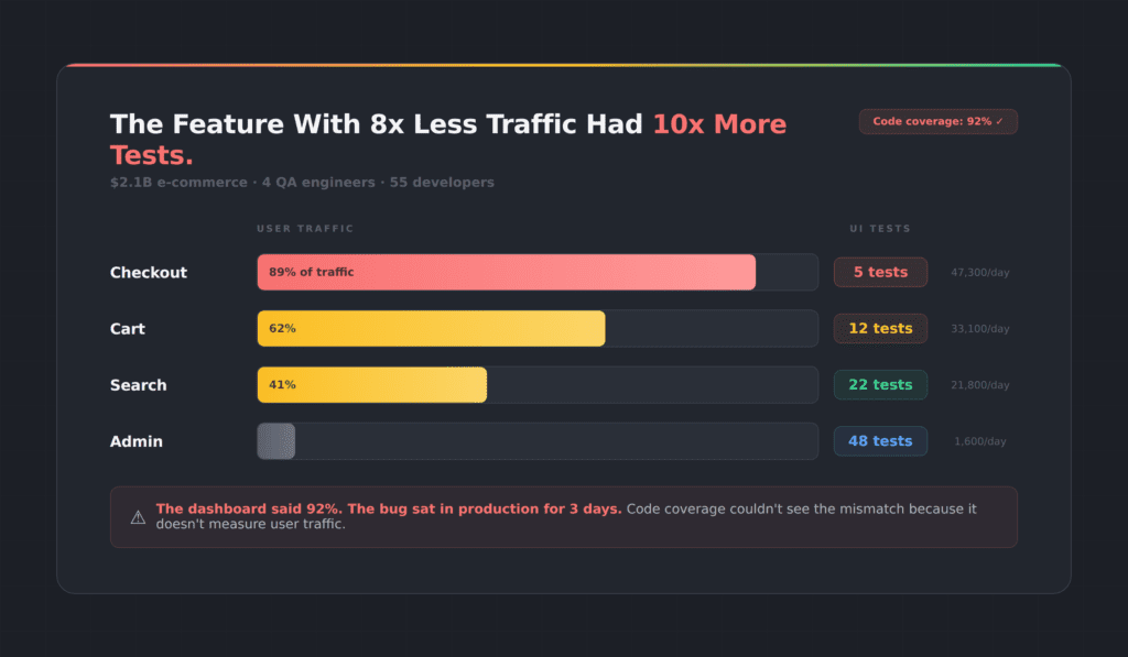
We ran an analysis on a $2.1 billion e-commerce platform. Four QA engineers, 55 developers, a mature test suite, and a code coverage score they were proud of.
Here’s what we found:
High traffic, almost no tests
Their credit card checkout flow handled 47,300 users per day. It had 5 tests.
Their PayPal integration handled 5,800 users per day. It had 48 tests.
Read that again. The feature with 8x less traffic had nearly 10x more tests. And their overall coverage metric? It looked great. The dashboard was green. Nobody on the team knew there was a problem until a payment bug slipped into production and sat there for three days before anyone noticed.
Three days in production
Three days. On a payment flow. At a company doing over $2 billion in annual revenue.
They weren’t negligent. They were misled. The metric they trusted to tell them where risk lived was structurally incapable of doing so. Code coverage measured how much code was touched. It said nothing about which users were affected.
Code coverage lies by treating every line of code as equal, and this team paid the price.
Why Code Coverage Lies to Every Team
The testing industry has spent two decades building tools around code instrumentation. Istanbul, JaCoCo, Cobertura, SonarQube — they all work the same way. Instrument the code, run the tests, count the lines that executed. Report a percentage.
Built for a different era of software
These tools were designed for unit testing in a world where applications were simpler and most logic lived in the backend. They made sense in that context. But we don’t live in that world anymore.
Modern applications are UI-heavy, JavaScript-driven, and user-behavior-dependent. The critical paths through your application aren’t defined by your code architecture — they’re defined by what your users actually do. And code coverage has no visibility into that.
The metric nobody wants to question
Here’s the other thing. Nobody wants to be the person who says “our coverage number is misleading” in a sprint review. The number has become organizational currency. It shows up in OKRs, in release gates, in executive dashboards. Questioning it means questioning the entire quality narrative the team has built around it.
So it persists. And teams keep shipping bugs on their most important features while their dashboards glow green.
Code coverage lies not because it’s broken, but because it was never built to measure what matters in a modern UI.
Five Ways Code Coverage Lies About Your Risk
Code coverage lies in five specific, measurable ways. Let’s be specific about the gaps.
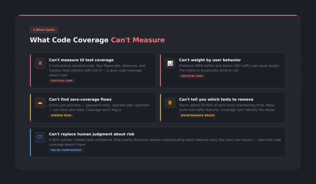
1. UI test coverage for Playwright, Selenium, and Cypress
If you’re running Playwright, Selenium, or Cypress tests against your UI, code coverage tools can’t tell you which pages, forms, buttons, and flows your tests actually interact with. They instrument backend code. Your UI is a black box to them.
2. User behavior and traffic patterns
Code coverage doesn’t know that your checkout page gets 89% of traffic while your admin panel gets 3%. Every line is equal. Every branch is equal. The metric is structurally blind to risk.
3. Zero-coverage user flows
You might have an entire user journey — say, the password reset flow or the upgrade path — with literally zero test coverage. Code coverage won’t flag it unless you already know to look for it. And if you already knew, you wouldn’t need the tool to tell you.
4. Which tests are safe to remove
This is the one that burns QA teams the most. Test maintenance consumes enormous amounts of time — industry data suggests QA teams spend anywhere from 20 to 50 percent of their work week maintaining existing test scripts. Many of those tests cover low-risk, low-traffic functionality that doesn’t justify the maintenance cost. But code coverage can’t tell you which ones are safe to cut, because it doesn’t know which functionality matters to users.
5. Real risk vs. false confidence
A 92% number gives teams a false sense of security. It substitutes a count for a judgment call. Actual quality decisions require understanding which parts of the application carry the most user impact — and that requires data that code coverage simply does not have.
What Is the Test Efficiency Score?
We built TestMap because we got tired of watching good teams make bad decisions based on a broken metric.
TestMap introduces what we call the Test Efficiency Score. Instead of counting how many lines of code your tests touch, it measures how well your test suite covers what your users actually do.
How TestMap measures UI test coverage
Here’s how it works. TestMap measures what your UI tests — Playwright, Selenium, Cypress — actually cover in the interface. Not at the code level. At the UI level. Which pages did your tests visit? Which forms did they fill out? Which buttons did they click? Which flows did they complete?
That measurement alone is valuable. Even without connecting any analytics platform, you can see your actual UI test coverage — the pages and elements your tests interact with, and the ones they miss entirely. Most teams we work with are surprised by how many zero-coverage flows they have. Features they assumed were tested because the code coverage number was high turn out to have no UI tests at all.
How analytics data adds risk weighting
Then, if you connect an analytics platform — Google Analytics, Mixpanel, or Amplitude — TestMap overlays real user traffic data onto that coverage map. Now you’re not just seeing what’s tested and what isn’t. You’re seeing what’s tested relative to how much users actually use it.
That’s the Test Efficiency Score. It’s coverage weighted by usage. And it tells a very different story than code coverage.
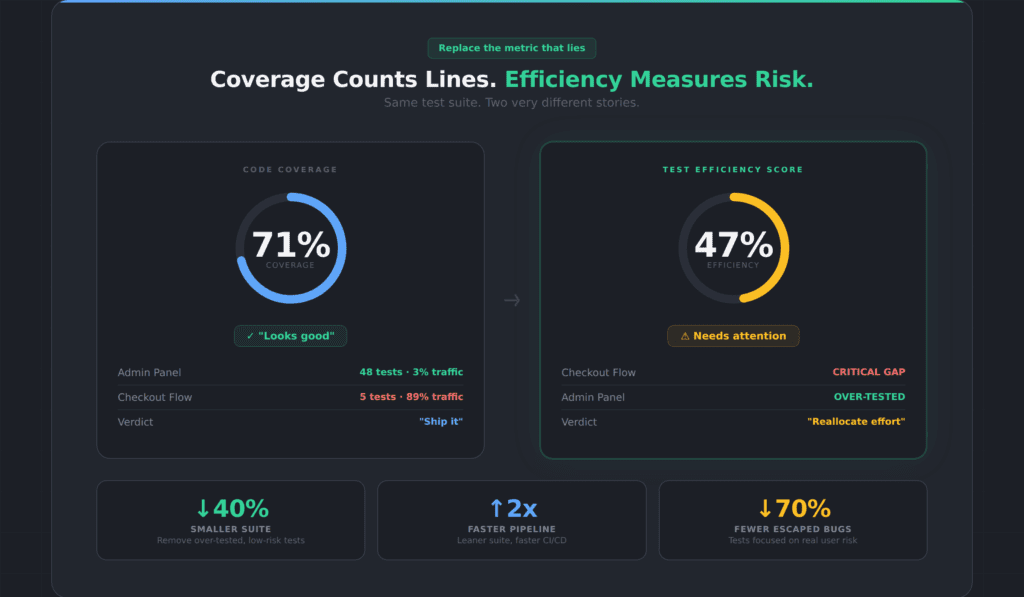
Where code coverage lies: same suite, different story
In the e-commerce example above, the team’s code coverage was 71%. Their Test Efficiency Score was 47%. The gap between those two numbers is exactly where code coverage lies — high-traffic features with minimal tests, and low-traffic features with excessive tests.
The Efficiency Score doesn’t just tell you where to add tests. It tells you where to remove them. When you can see that your admin panel has 48 tests covering 3% of traffic, you can confidently reallocate that testing effort to the checkout flow that handles 89% of traffic and has almost no coverage. You reduce your suite size, speed up your CI pipeline, and actually improve quality — all at the same time.
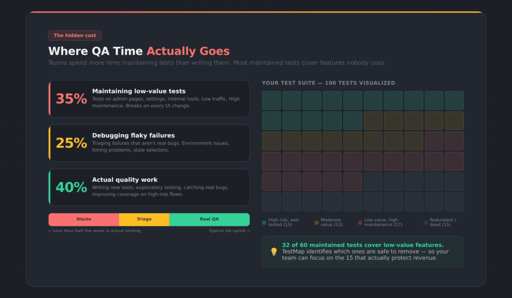
How Code Coverage Lies About Test Maintenance
Here’s a number that doesn’t get enough attention: QA teams running Playwright, Selenium, or Cypress automation typically spend somewhere between 20 and 50 percent of their working hours maintaining existing test scripts. Not writing new tests. Not exploring new features. Just keeping old tests from breaking.
Most maintained tests cover features nobody uses
And the worst part? A significant chunk of those maintained tests cover functionality that almost nobody uses. Teams are burning sprint cycles to maintain tests on low-traffic admin pages, rarely-used settings panels, and internal tools — while their highest-traffic user flows remain under-tested or untested.
Without data, teams can’t prioritize
The reason is simple: without data on what users actually do, teams can’t make informed decisions about which tests justify their maintenance cost. So they maintain everything. The suite grows. CI pipelines slow down. Every UI change breaks a dozen tests that all need manual fixing. And the cycle repeats.
How the Test Efficiency Score fixes test maintenance
This is the problem that a better metric solves. When you can see that a test covers a feature with 2% of user traffic and a stable UI that hasn’t changed in six months, you can make a rational decision about whether that test is worth the maintenance overhead. When you can see that your checkout flow has zero UI test coverage despite handling 89% of user traffic, you know exactly where to invest your next sprint’s testing effort.
The bloated test suite problem isn’t a discipline problem. It’s a visibility problem. Teams aren’t lazy — they’re blind. Code coverage lies about what’s worth maintaining because it can’t see which features your users actually depend on.
Who Should Care About This (And What to Do)
QA engineers and test leads
If you’re a QA engineer or test lead, this probably isn’t news to you. You’ve felt the disconnect between the coverage number and the bugs that keep escaping. You’ve watched your team spend days maintaining tests that don’t seem to matter while critical features ship with minimal validation. You’ve suspected the metric was misleading, but you didn’t have a way to prove it or an alternative to point to.
Engineering leaders and VPs
If you’re an engineering leader or VP, the coverage number on your release dashboard might be the most dangerous metric in your organization. Not because it’s wrong — it accurately counts what it counts. But because it creates confidence where caution is warranted. It tells you the tests are thorough when they might be thoroughly aimed at the wrong things.
Product managers
If you’re a product manager, the test coverage number is probably something you glance at and move on. But if your team is shipping bugs on high-traffic features while the dashboard says 92%, you’re living with the consequences of a metric that doesn’t measure what matters to your users.
How to Move From Code Coverage to UI Test Coverage
Once you understand how code coverage lies, the path forward is straightforward. The shift doesn’t require throwing out code coverage entirely. Code coverage still has value for unit testing, for catching regressions in business logic, for verifying that backend code paths are exercised. It’s a useful tool for what it was designed to do.
But it was never designed to be the single quality metric for a modern application with a complex UI and millions of users. Using it that way is like using a speedometer to measure fuel efficiency. It’s measuring something real — just not the thing you need to know.
Step 1: Measure your actual UI test coverage
See what your Playwright, Selenium, or Cypress tests interact with at the UI level — not at the code level. Find the zero-coverage flows. Find the pages your tests never visit. This alone changes the conversation.
Step 2: Connect your analytics platform
See which of those coverage gaps carry real user risk. A zero-coverage flow that gets 0.1% of traffic is very different from a zero-coverage flow that handles your payment processing. TestMap supports Google Analytics, Mixpanel, and Amplitude.
Step 3: Track the Test Efficiency Score, not coverage percentage
Track whether your tests protect what your users actually depend on — not just whether your tests execute a lot of code. Use the Test Efficiency Score as your north star.
Step 4: Optimize and reduce your test suite
Remove tests that cover low-traffic, low-risk functionality. Redirect that effort to the high-traffic flows that are under-tested. Shrink the suite. Speed up the pipeline. Reduce maintenance. Catch more of the bugs that actually matter.
That’s the path from “92% coverage and a payment bug in production” to “47% efficiency and a suite that protects what users care about.” Code coverage lies. The Efficiency Score tells the truth.
Frequently Asked Questions About Code Coverage and UI Test Coverage
Is code coverage useless?
No. Code coverage is useful for unit testing and verifying backend logic paths. The problem is using it as the primary quality metric for a modern UI-driven application. It measures code execution, not user risk. Use it for what it’s designed for — just don’t use it as your only quality signal.
What is the Test Efficiency Score?
The Test Efficiency Score is a metric developed by Appsurify for TestMap that measures how well your UI test suite covers the features your users actually use. Unlike code coverage, which treats every line of code equally, the Efficiency Score weights coverage by real user traffic data from analytics platforms like Google Analytics, Mixpanel, or Amplitude. A high Efficiency Score means your tests are focused on what matters. A low score means your testing effort is misallocated.
Can I measure UI test coverage without connecting analytics?
Yes. TestMap measures what your Playwright, Selenium, or Cypress tests cover at the UI level — which pages they visit, which elements they interact with, which flows they complete — without requiring any analytics platform. Analytics adds risk-weighting, but the base coverage measurement works independently.
What is the difference between code coverage and UI test coverage?
Code coverage measures which lines of source code were executed during testing. UI test coverage measures which pages, elements, forms, and flows your UI tests actually interacted with in the browser. You can have high code coverage and still have critical UI flows that no test ever visits.
How does TestMap connect to Google Analytics, Mixpanel, and Amplitude?
TestMap supports Google Analytics (GA4), Mixpanel, and Amplitude via secure OAuth connections. The connection is read-only — TestMap reads traffic data but never modifies your analytics configuration. Setup takes under five minutes.
What UI test frameworks does TestMap support?
TestMap works with Playwright, Selenium, and Cypress. It measures UI coverage at the browser level, not at the framework level, so your existing test scripts work without modification.
How quickly can a team see results with TestMap?
Most teams see their first UI coverage map within 30 minutes of connecting their test framework. If you connect analytics, the traffic-weighted Efficiency Score is available within the hour. The “aha moment” — the first time a team sees a high-traffic flow with zero test coverage — usually happens in the first session.
TestMap by Appsurify is the only tool that measures UUI test coverage for Playwright, Selenium, and Cypress, then connects analytics to prioritize by real user risk. See your coverage gaps free →